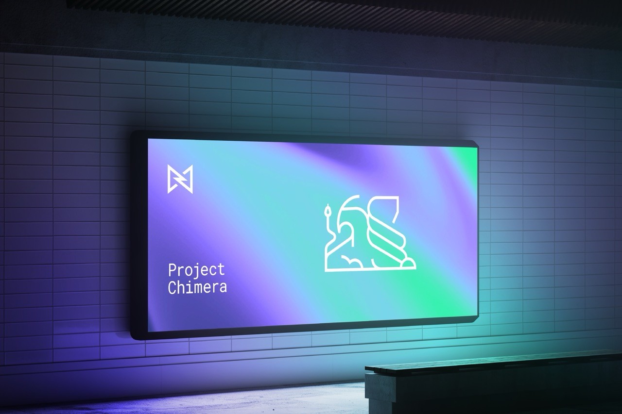
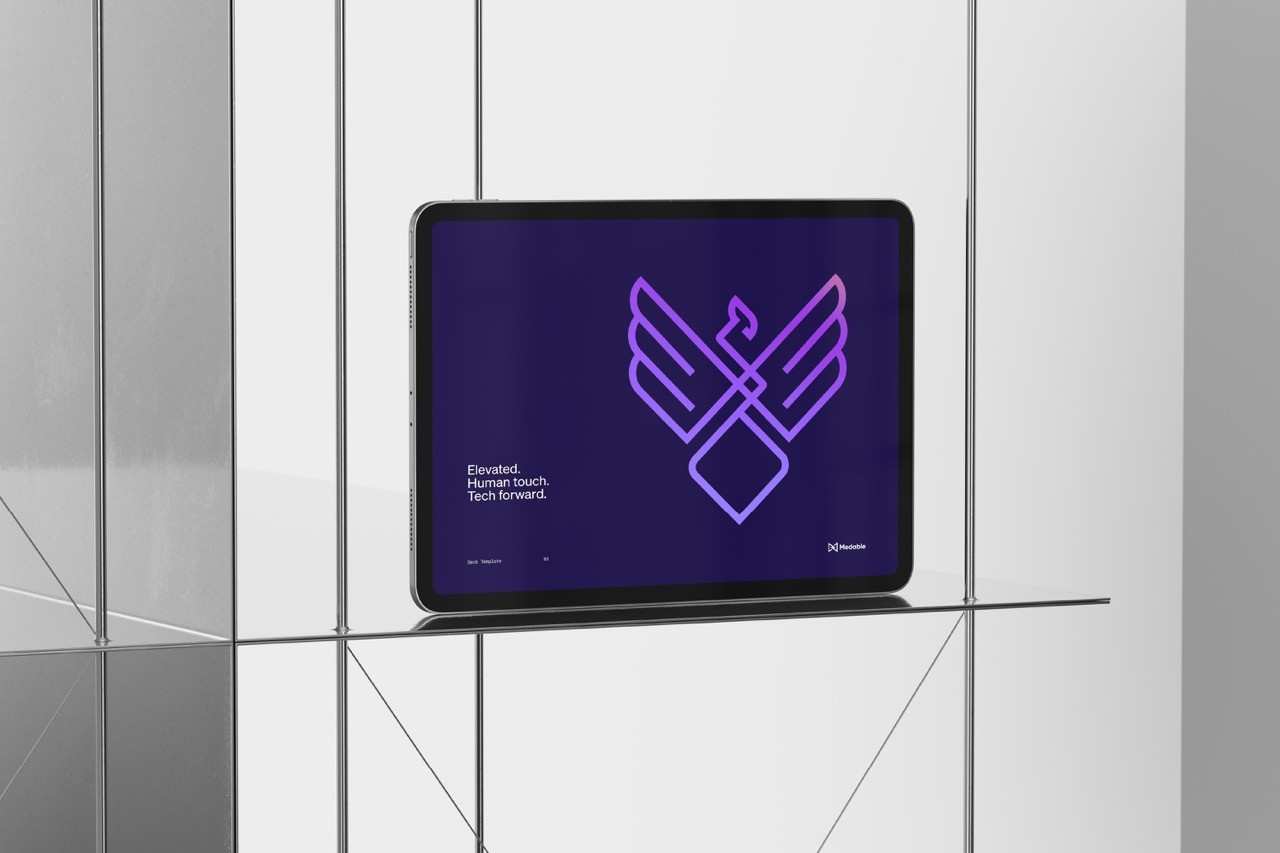
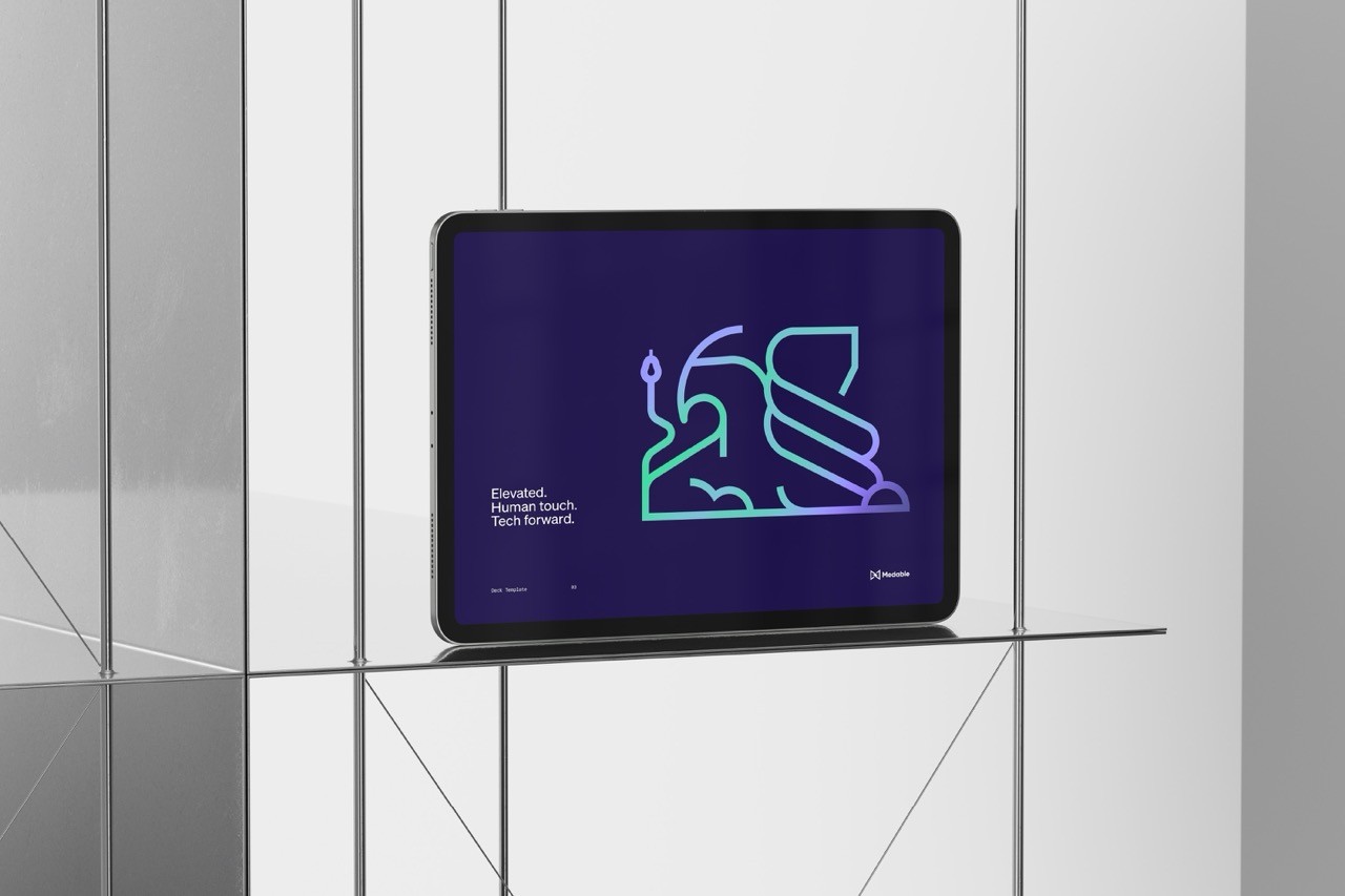
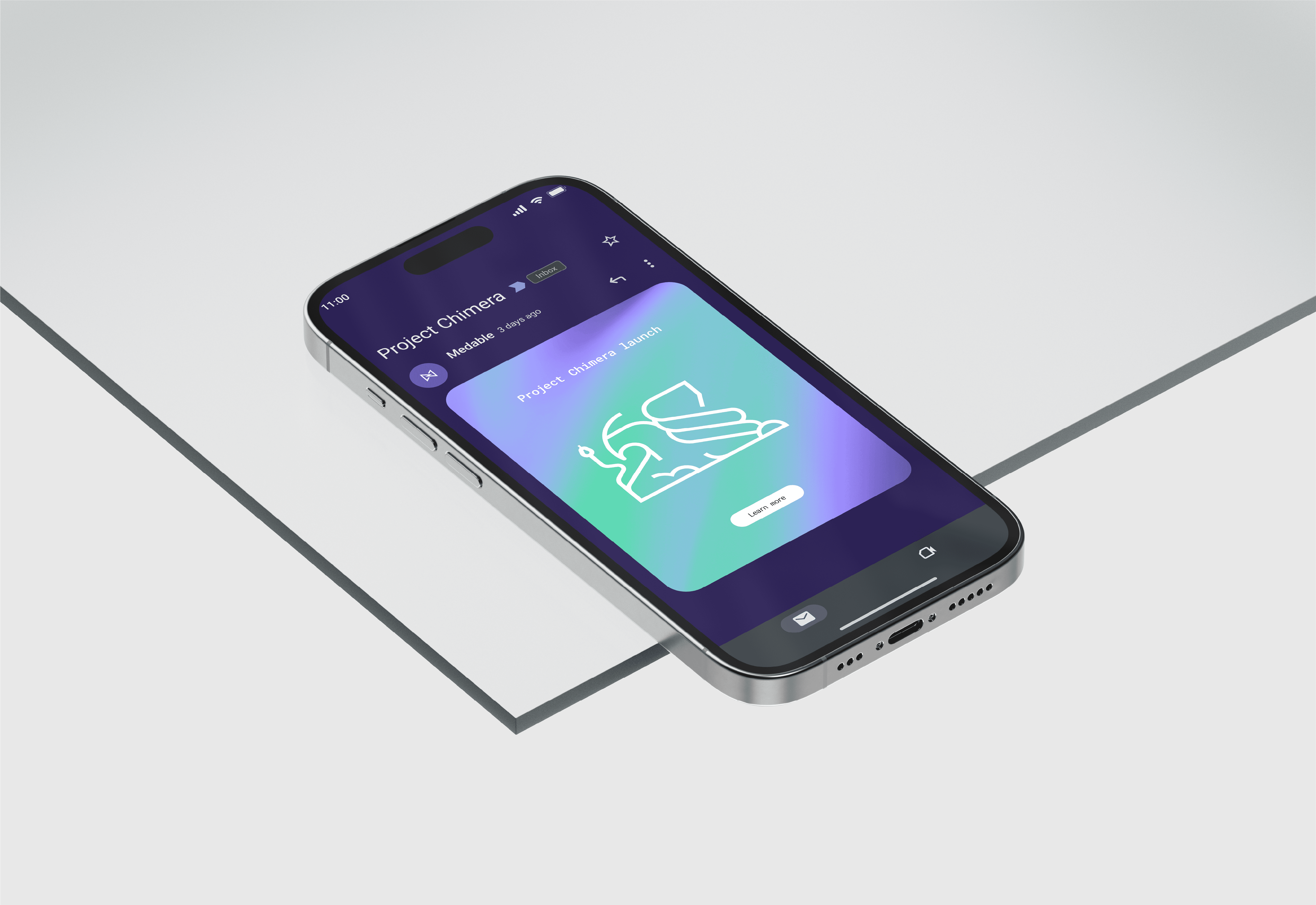
Project Phoenix & Chimera
Client:
Medable
Year:
2023
Services:
Logo Design
Deliverables:
Scalable logo design
Project Phoenix & Chimera focused on creating distinct yet cohesive visual identities for two major product releases at Medable. Through a minimalist monoline design approach, we developed logos that captured the spirit of each release—strength for Chimera and rebirth for Phoenix—while laying the groundwork for a scalable brand system.

Overview

More Project’s:

