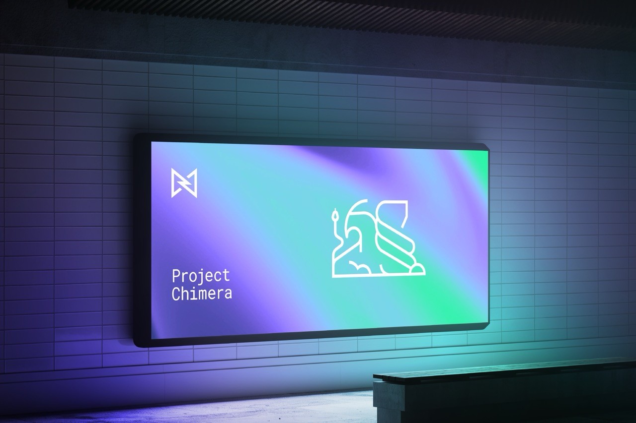
Medable 3.0
Client:
Medable
Year:
2022 - 2023
Services:
Motif
Deliverables:
Motif System & Brand Guidelines
As part of Medable’s rebrand, I designed a flexible motif system to help visually communicate core themes like Decentralization, Connection, and Scalability. The goal was to move away from a rigid, outdated identity and build abstract visuals that could scale across formats and support storytelling. The result gave the team a versatile tool to reinforce Medable’s mission and elevate its perception as a health tech innovator.
/ Overview
/ empathize
1.1 Brand Challenge
Medable is a leader in Decentralized Clinical Trials, building inclusive technology to expand global access to effective therapies. Despite their bold mission and innovative impact, the brand’s visual identity failed to reflect its depth and disruption.
The existing system lacked flexibility across digital and print platforms
Internal sentiment described it as sterile, stark, and overly clinical
As a category creator, Medable needed a visual identity that conveyed innovation, connection, and adaptability
This disconnect prompted a rebrand that could realign visual expression with Medable’s values and vision.
1.2 Research & Discovery
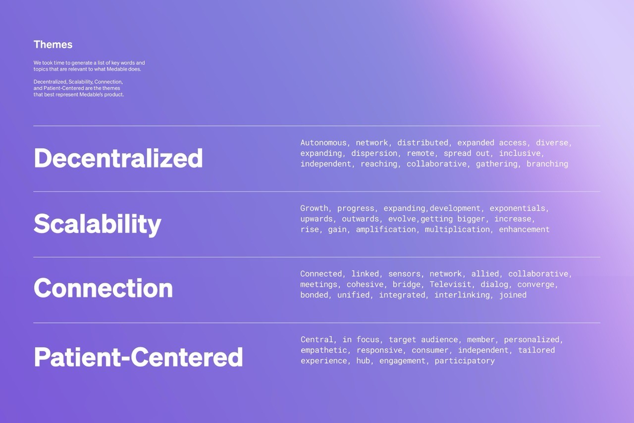
To redesign with intention, we began by distilling Medable’s core values through collaborative research. This involved a company wide audit, cross-functional brainstorming, and a thematic word-dump from all available materials.
We also analyzed peer companies to understand how others communicated complexity in a more nuanced, accessible way.
From there, we began asking critical questions that shaped the direction of the motif system:
What works or fails in our current system?
How abstract, illustrative, or literal should visuals be?
Will repetition enhance or dilute meaning?
What shapes, line weights, or design principles should we use?
How can we consider motion and dynamism from the start?
Ultimately, the research guided us toward a motif system that could simplify complexity and resonate deeply—serving as both a functional asset and storytelling tool.
/ define
2.1 Translating Themes into Visual Language
My role was to translate Medable’s core themes—Decentralization, Patient-Centered, Connection, and Scalability—into a visual language that felt abstract yet intentional. These motifs supported brand storytelling by visually reinforcing the narrative without relying on literal representations.
I collaborated with senior designers, the Creative Director, Brand and Marketing leads, and stakeholders across Patient Success and Demand Generation to align on language, sentiment, and audience perception. Insights from this cross-functional collaboration guided how the motif system would support the rebrand’s goals and resonate with both internal and external audiences.
2.2 Establishing Design Constraints and Principles
Through exploration and cross-team discussion, we defined key constraints to guide the motif system:
Favor abstract over literal representation
Use fundamental shapes—line, circle, square, triangle
Ensure motifs are flexible across color and context
Design with motion in mind for future scalability
These principles grounded the visual system in clarity and adaptability, allowing it to evolve with Medable’s expanding brand while simplifying complex concepts for broader audiences.
/ ideate
3.1 Exploration Through Abstraction
I began this phase by sketching being intentional by avoiding visual references to keep the ideas instinctive and unfiltered. The goal was to freely explore visual forms rooted in Medable’s abstract themes. Once the initial ideas were exhausted, I transitioned into building moodboards to develop stronger conceptual directions and visual cohesion.
This process helped translate loose sketches into defined concepts with unique personalities, paving the way for focused iteration.
3.2 Testing, Refining, Repeating
Iteration was where the design system came to life. We revisited our original design questions and constraints as a guide, using them as a checklist to evaluate clarity, adaptability, and brand alignment.
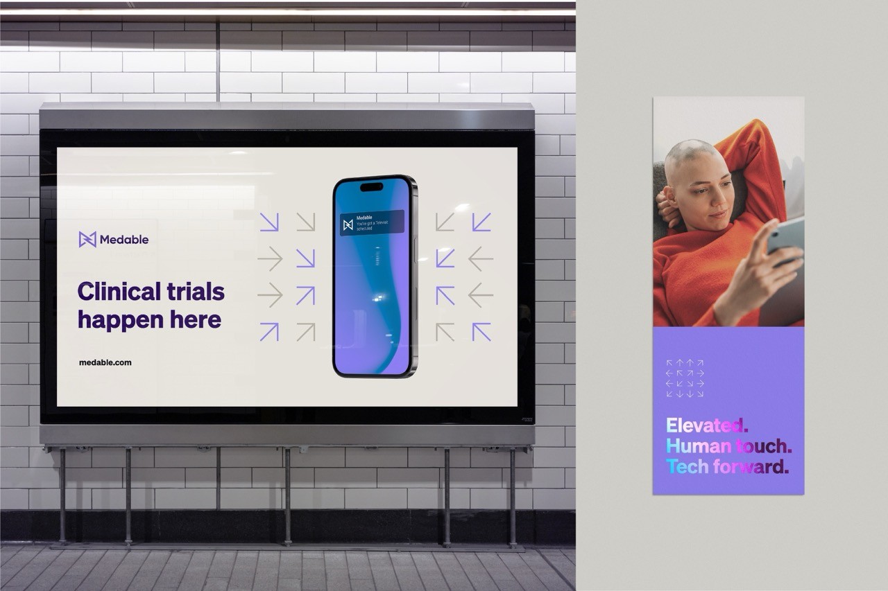
We tested motifs across real use cases—ads, white papers, and eBook covers—to assess scalability and responsiveness. Every iteration pushed us to refine the balance between abstraction and function, making sure the motifs could carry meaning without becoming too literal or decorative.
These were some of the guiding questions during refinement:
How many elements are too much?
How thick should the strokes be?
In what contexts should motifs appear—or not?
Do arrows or directional shapes convey the right themes without confusion?
Do any motifs unintentionally resemble UI elements like buttons?
How does meaning shift depending on placement and surrounding content?
Each answer helped us shape a system that felt purposeful, dynamic, and brand-aligned.
/ Prototype
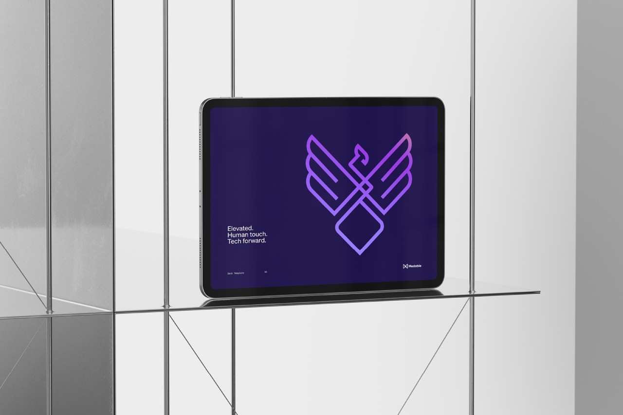
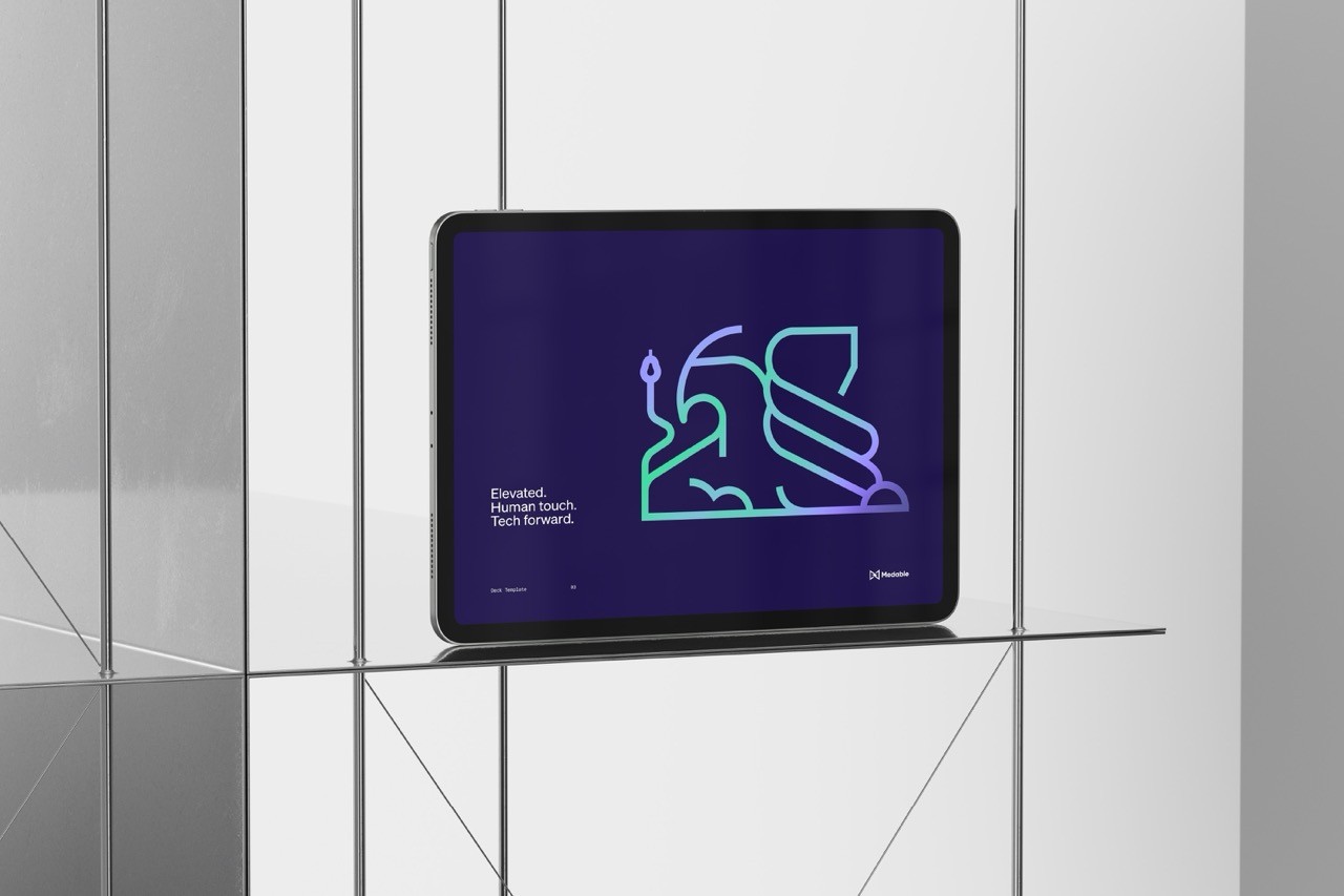
4.1 Final Motif System
The final motif system is composed of clean, abstract shapes—lines, circles, triangles, and squares—arranged in dynamic yet minimal compositions. Each motif was designed to visually express Medable’s core themes: Connection, Decentralization, Scalability, and Patient-Centered Design.
This system strikes a balance between flexibility and structure, allowing it to scale across use cases without losing intent. The simplicity of form creates room for interpretation, and when paired with messaging or context, the motifs help reinforce Medable’s narrative visually—without relying on literal imagery.
Each element was built with motion potential in mind, so they could later evolve into animated assets that further elevate storytelling in product and marketing.
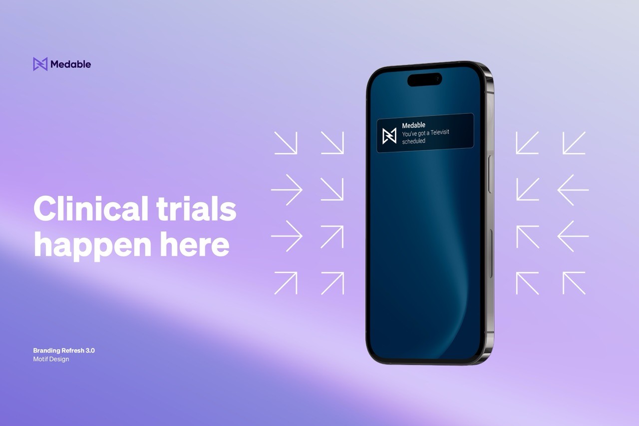
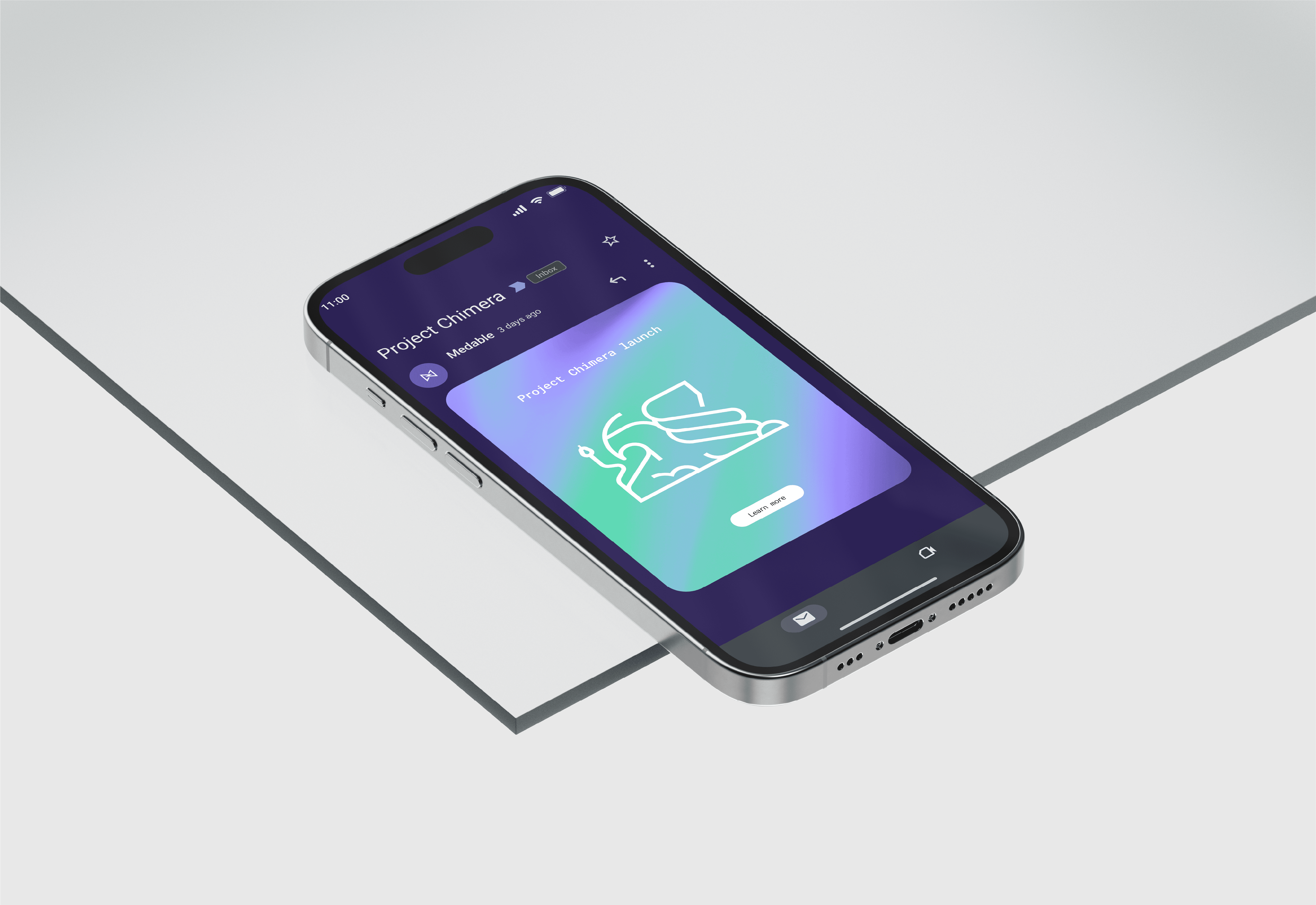
4.2 Application in the Brand Ecosystem
Once finalized, the motif system was applied across Medable’s key brand touchpoints to test real-world function and resonance. From ads to eBooks, white papers to web graphics, the motifs helped create visual consistency across channels while elevating brand expression.
Each application was used to test scale, responsiveness, and the motifs’ ability to pair with content. We ensured motifs supported the story without distracting or feeling ornamental. Importantly, the motifs allowed Medable’s complex subject matter to feel more approachable, visually reinforcing the brand’s values in every asset.
/ impact
5.1 Turning Insight into Impact
The refreshed motif system received strong positive feedback internally and externally. In all-hands and follow-up meetings with key stakeholders—including the Creative Director, Director of Brand and Marketing, and Director of Demand Generation—the consensus was that the new visual language better aligned with Medable’s evolving identity.
By leaning into abstraction, the system now serves as a flexible storytelling tool that captures the essence of Medable’s values: decentralization, innovation, connection, and accessibility. Its meaning becomes clear when paired with content, reinforcing the idea that context is essential in visual communication—especially for a category-defining brand like Medable.
/ reflection & learnings
6.1 Designing with Concept at the Core
This project taught me how to think more conceptually and distill complexity into clear visual systems. It was my first time translating a brand’s core values into abstract motifs—assigning meaning without being literal. I learned how to build on an idea, test it, refine it, and trust that strong design can guide understanding even when the subject matter is complex.

More Project’s: